
Making Images Responsive
When adding an image into the Page Editor, the editor will assign a pixel width and height to the image. You can see this when you right click on an image and view the Image Properties. The default behavior of assigning an image a pixel size prevents the image from getting smaller on a mobile phone-sized screen, which causes the entire web page to be wider then the screen on smaller devices. In other instances, the image width can resize but not the height which causes image distortion. The screen size for a Legionsite web page can be as small as 320 pixels wide on a phone, to 1200 pixels on a desktop computer. Images need to sized using a percentage value rather than pixels to allow them to respond and resize on different screens.
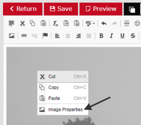 Right-click and select "Image Properties."
In your editor, right click on the image and select "Image Properties." The properties dialog will appear in which along the top there are tabs. Click first on the "Image Info" tab. Revise the "Width" to 100% and remove the value for the "Height."
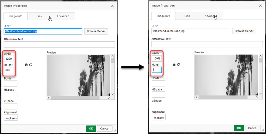 Revise the width and height values.
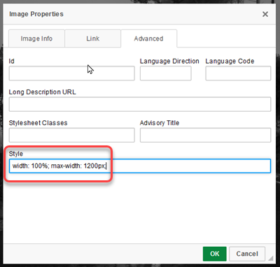
Now click on the "Advanced" tab and revise the "Style" field. The width in the field should already be filled in with 100%. Now, add a "max-width" setting to this field. The image in this example was 1200 pixels, so the input would be: max-width: 1200px;
 Add the max-width value in the Style field.
This "Style" input is used for additional styles. The max-width setting sets an upper limit and prevents the image from increasing beyond that width. This max-width should never be more than the actual width of the image, or 1200 pixels. For any images that are 1200 pixels or more, the setting should be 1200px. For images that are less than that, the max-width setting should be the actual width of the image. Any image that is less than 320 pixels does not have to be revised as shown above. The 100% width setting will allow the image to be as large as it can but never more than the maximum width setting. A height setting is not needed. These settings together will allow the image to shrink proportionately to the size of the screen on smaller devices; thereby, making the images responsive.
Remember, any image can be given a max-width setting that is smaller than its actual width, but it should never be given a value larger than its actual width.